Designing with Intent: moodboards, palettes, and UI‑influenced rooms
Every memorable setup has a design language. You can feel it in the choices—the way light glides across surfaces, how objects relate, how accents harmonize rather than compete. This article offers a method to move from scattered references to a fluent, UI‑inspired room that supports play and creation. We’ll assemble moodboards, define palettes, and apply interface principles to furniture and storage so that your environment becomes readable at a glance.
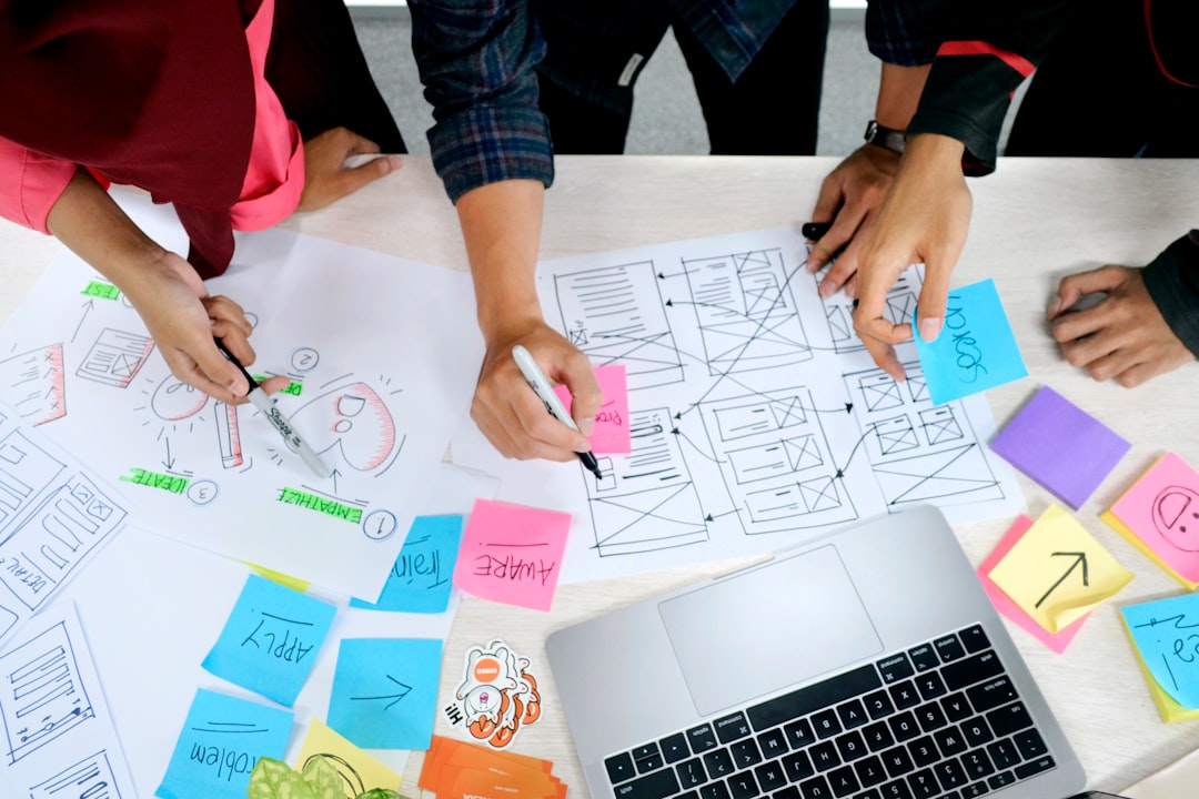
1) Build a tight, task‑based moodboard
Collect references with intention. Instead of a single “vibe” board, create three micro‑boards mapped to your key tasks: Play, Make, and Share. For Play, gather shots that show lighting and sight lines around screens. For Make, collect desks with clear tool zones and cable discipline. For Share, focus on backgrounds that look good on camera without stealing attention. Limiting each board to 7–9 images forces clarity. Add one real photo of your current space to each board; it anchors imagination to reality.
2) Define a palette like a UI
Interfaces succeed on consistency. Choose one base, one surface, one highlight, and two accent colors. Base should be your wall or major furniture tone; surface is the desk and storage; highlight is metals or hardware; accents are small splashes that guide attention. Keep saturation low on large areas and reserve color “energy” for smaller objects like a desk mat or a framed print. If you love RGB, pick two gentle hues and disable fast cycling; subtle motion reads as polish, not noise.
3) Typography for the room
Type organizes thought. Rooms benefit from a similar hierarchy. Consider “headlines” as large shapes—your monitor cluster, a bookshelf, a curtain wall. “Subheads” are mid‑size elements—speakers, lamps, storage cubes. “Body text” is the texture—cables, pens, small props. Arrange headlines first for clean sight lines and balanced weight. Then place subheads symmetrically or in clear thirds. Finally, manage body text carefully; too much texture equals visual chatter.
4) Spacing and margins
Leave real margins on the desk. A band of empty space in front of your keyboard improves breathing room for wrists and makes your surface feel intentional. Mirror this with wall margins around frames and shelves. When in doubt, remove one item rather than squeezing everything in. Negative space is not wasted—it’s the canvas that makes interaction feel crisp.
5) Affordances: make use obvious
Small handles, trays, and visible slots communicate function. Give controllers a dock, drawing tools a cup, headphones a hook. Label drawers with minimal icons—controller, pen, camera—so your brain reads them at a glance. Keep frequently used items within arm’s reach on your dominant side. Store rarely used gear out of sight to protect focus. The result is a room that “teaches” you how to use it every day.
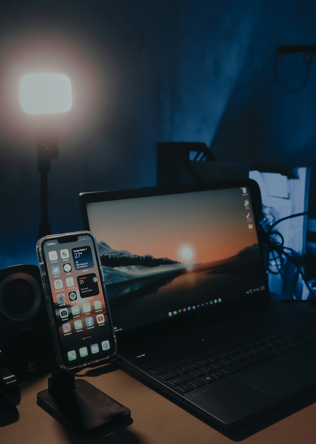
6) Light as feedback
Set scenes that signal state changes: Create, Play, Share. Create mode: neutral ambient with a soft task lamp; Play mode: slightly cooler ambient with accent dimmed; Share mode: background accent elevated, task light lowered to reduce facial glare. Practice 3–5 second fades between scenes so shifts feel calm. If you stream or record, keep a consistent key light position to maintain a reliable look from session to session.
7) Texture discipline
Texture is your silent accent. Pair matte desks with a single glossy element (like a monitor), or vice versa. If your chair fabric is busy, keep the wall quiet; if the wall has texture (brick, wood), choose simpler desk surfaces. Texture contrast adds depth without adding color noise. Photograph your space in black and white to check texture balance objectively.
8) The final pass: a design checklist
Run this checklist each month: Are my accents still purposeful? Is any motion distracting? Are cables creating unwanted texture? Do my tools have clear homes? Is my background camera‑ready? Have I saved new lighting scenes that match the season? A regular review keeps the room evolving with your projects rather than calcifying into yesterday’s taste.
Glossary
- Affordance
- A visual cue that suggests how an object should be used—hooks, trays, slots.
- Negative space
- Deliberate emptiness that improves readability and comfort.
- Design language
- A system of recurring choices—color, spacing, shape—that creates coherence.